Royal Albert Wharf
The creative
A distinctive brand for a new waterside neighbourhood steeped in heritage, yet appealing to a young modern London market
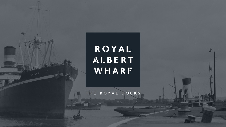
The brief entailed creating a memorable and long lasting brand to put this remote part of London’s Docklands on the map and drive both value and positive sentiment to the area. The brand mark celebrates the heritage of the sites shipyard history and transport connections.


A brand to celebrate the heritage.
We created a customised stencil typeface based on the font Johnston ITC. The lettering has been used upper case and given a stencil treatment as a nod to how text was applied to shipping containers when the dock was an active shipyard.


Bringing the proposition to life.
In order to create a place, we humanised the environment and created a feeling of community. The strategy leveraged the areas transport connections as reasons to buy into Royal Albert Wharf. ‘Your new neighbourhood connected to the city’ was created as the platform for the campaign messaging. The brochure was printed on an uncoated stock, with die cut lettering to the brand on the front cover.


Enhanced production values
The brochure combined the maritime and trading themes of heritage with full bleed illustrations depicting the future of the scheme. The waterside lifestyle is brought to the fore, whilst infographics show the key selling points in an engaging way. The location of the scheme has been lovingly crafted into an illustrated map and the local area is further brought to life through the people who already enjoy the lifestyle. The history of the site that influenced the brand was taken through to the materials and finishes of the marketing suite.
Bespoke illustrations
The illustrated map of London was visually appealing and certainly worked well as a wall graphic in the Marketing Suite.

Whilst working at
FPCG
